For quality, impact and endurance.


Typography tips for designers

1) Practice typography to win a glance
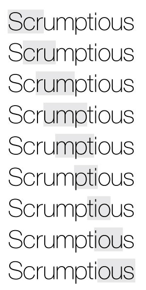
3 letters at a time.

For headlines, headings, subheadings or single lines of important areas of text you can adjust the letter spacing (kerning) to look balanced, consistent and to your artistic preference of either tight, normal or airy spacing.

Begin by highlighting the line of text and, with your design program find the letter spacing tool and adjust the spacing tighter or wider to your taste. Then to balance individual letter spacing even further, point the cursor to the end of the first letter and second letter and adjust further. Then advance to the next letter and adjust it to match the previous kerning. Continue through to the last letter. Your typography will have balance, style and a cutting edge.

2) Choose good photography.

Lighting is the palette for photographers. Thoughtful lighting shapes and enhances the impact of its object. Look for it when choosing your sources. Drama, composition and form are very beneficial. Flat is not. I’d also recommend finding a source with a reputation for crisp, well focused images as well – for even more impact.

Compare these photographs … Appealing vs. flat?

Graphic design and photography advice
Tips for better graphic design

3) Tension trumps symmetry.

Good design has a bit of tension. Arrange elements in bunches, off center, or on a slight angle. Avoid calculated distances, centering and straight lines, which tend to ‘tire’ quickly. Good tension creates an enduring quality that upholds a vibrancy and freshness which continues to delight the viewer.

4) Pick the best. Leave the rest.

When your design is nearly complete, stand back, evaluate and review each element and ask yourself, “is that helping or hurting the design?”. Remove or reposition elements that aren’t contributing to the “whole” composition. Then fine-tune your design and repeat this step once again. -By Tony at Madison Creative.